Retired institutional analyst and math instructor Mia Kalish has won second place in the international SayYesToKaffeCollective Challenge for her quilt “Roman Tiles – Flowers of Burano.” The challenge required participants to use 50 percent of their fabrics from the August 2020 collection and the remainder from the Kaffe Collective fabrics of their choice. For her efforts, she will receive one-half yard of each of the fabrics from the Kaffe Collective February 2021 collection, shipping to stores in February and March.
The Kaffe Collective is a group of three designers: Kaffe Fassett, who is known throughout the world for his color choices and combinations and especially for his big, bold floral designs and the jazzy geometric of his partner Brandon Mably are a perfect foil for Kaffe’s designs. The third designer in the group is Philip Jacobs, who is responsible for the magnificent colors in Kaffe’s fabrics, and who also markets his own fabrics under his Snow Leopard label.
The challenge included quilters participating from Europe, Russia, Asia, Australia and New Zealand. For many, getting fabrics was difficult. Two coincidences contributed to Kalish’s success in the challenge. The first was her long-time love of Kaffe’s and Phil’s fabrics.
“I already had my own collection,” she said. “All quilters have ‘stashes,’ lengths of fabrics that have caught our eye in stores, at shows, and with Covid, especially online but mine had more than its share of choices for my quilt.”
The second fortunate coincidence was the arrival of Threadbear Quilt and Yarn Shop, relocated from Las Vegas, NM to 2205B Main Street in Las Cruces. Owners Michael and Ann Siewert are lovers of Kaffe and Phil’s work and had ordered a selection of the August 2020 collection. Having fabric “in hand” is important when choosing colors for patterns and being able to purchase fabrics was really the “make or break” situation.
“I don’t know what I would have done without Ann and Michael, especially Michael, who was a sounding board for my color and pattern selections and who was fluent in Phil Jacobs,” Kalish said.
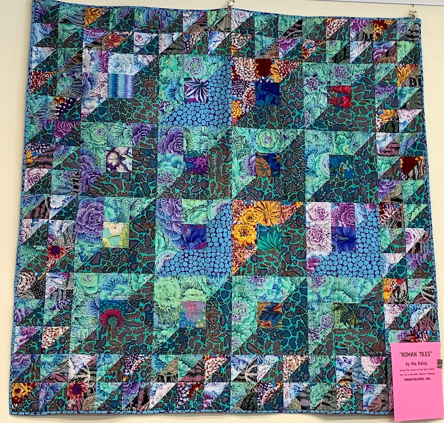
The challenge quilts were patterns selected from “Kaffe’s Quilts in Burano,” available in paperback and participants were able to choose from eight options. Kalish said “Roman Tiles” was strikingly different from the other choices. The 16 center blocks were halved on the diagonal from left to right with the darker fabric on the left and the lighter on the right. Part of the design work involved choosing fabrics that would replicate the overall theme of Kaffe’s design and that met the ratio requirements.
“When the fabric finally came, it was another one of those times when everything was shut down because of a surge in infections” Kalish said. “When Threadbear finally was able to let us in, I took everything I had planned to use and went in to finally be able to check my fabric choices IRL, in real life.
“That was such an exciting and anguished day,” she said. “I was so scared. I wondered, ‘Are these going to work?’”
One of the most interesting things about quilting, unless one is working with a preestablished pattern and associated fabrics, is that the final outcome is always a surprise. The quilt evolves through a process of pieces. First, the fabric is cut, then individual components are assembled. This is called piecing. Smaller components, usually squares, rectangles and triangles, are sewn together to form the basic quilt component, the block. The blocks are then arranged and sewn together according to the pattern design and the border added. Following this, the quilt top, as it is now called, is layered with batting, in the middle, and backing, which completes the quilt structure.
“For the dominant dark fabric, I used Brandon’s ‘Animal’ in green,” she said. “It combined nicely with Phil’s ‘Brassica,’ also in green. I purchased a fat quarter bundle of the new collection to use for the small centers of the main blocks, and completed the pattern with another of Brandon’s fabrics, ‘Plaid,’ in red, along with some Duck Egg Blue jumble that I had been able to find online while I was waiting, and planning. I laid everything out in Microsoft Excel.
“For the backing I chose ‘Ombre Leaves’ in bright pink. The backing was absolutely the opposite of the top in color and pattern and I thought at the time it was so very Kaffe, but it worked, it all worked, and it was a wonderful experience.”


